

Corporate Rebranding for Interlace
branding / corporate identity / tech
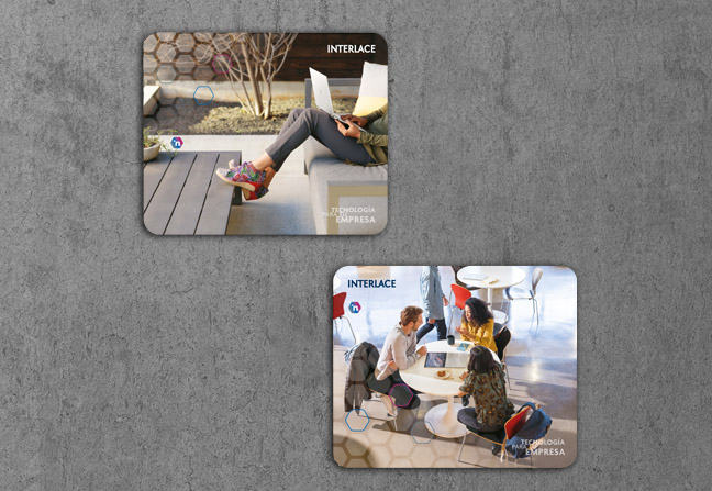
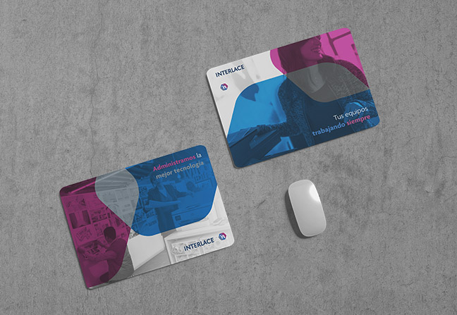
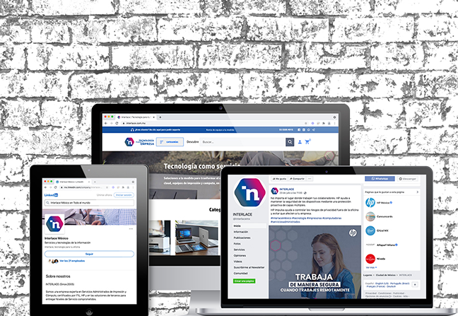
In 2021, we designed the corporate rebranding for the Interlace brand. This involved creating an icon that simply represented the word “Interlace” with the syllable “in” within a hexagon, featuring a gradient of the new proposed colors to convey a sense of technology. The design also included stationary like business cards, mouse pads, and email signatures. The new corporate identity was subsequently applied internally on the website, social media, and in new social media posts. Finally, the printing material and brand identity manual was designed and developed.
More of Branding
To see another example of corporate rebranding: Integrando
An example of corporate branding: Quickar

This post is also available in ESP / ENG.