
Case study: Event branding for mining convention

Branding / event / logotype / identity
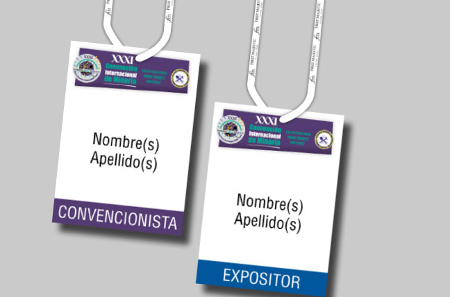
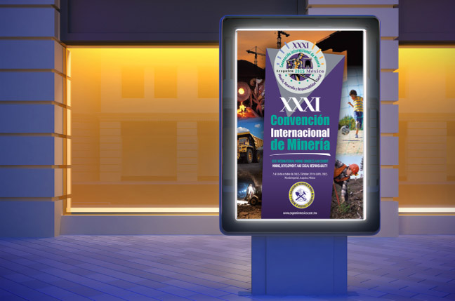
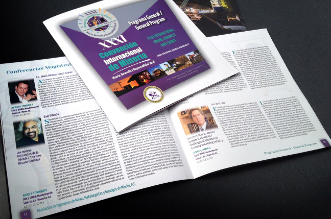
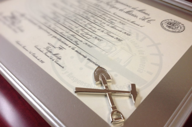
For 2015, the event branding for the mining convention was developed with a much more modern approach. The convention’s identity was designed by keeping the original typography of the name to ensure consistency and recognition year after year, while using a distinct color from previous events to generate more interest and relevance. The logo design is figurative, incorporating modern graphic elements and a circular shape to continue the tradition of creating a silver coin. The event’s visual identity is supported by striking photography to capture the attention of younger generations interested in earth-related topics and its various fields. The convention is organized by the Asociación de Ingenieros de Minas, Metalurgistas y Geólogos de México, A.C (AIMMGM). This was a success project case.
This post is also available in ESP / ENG.